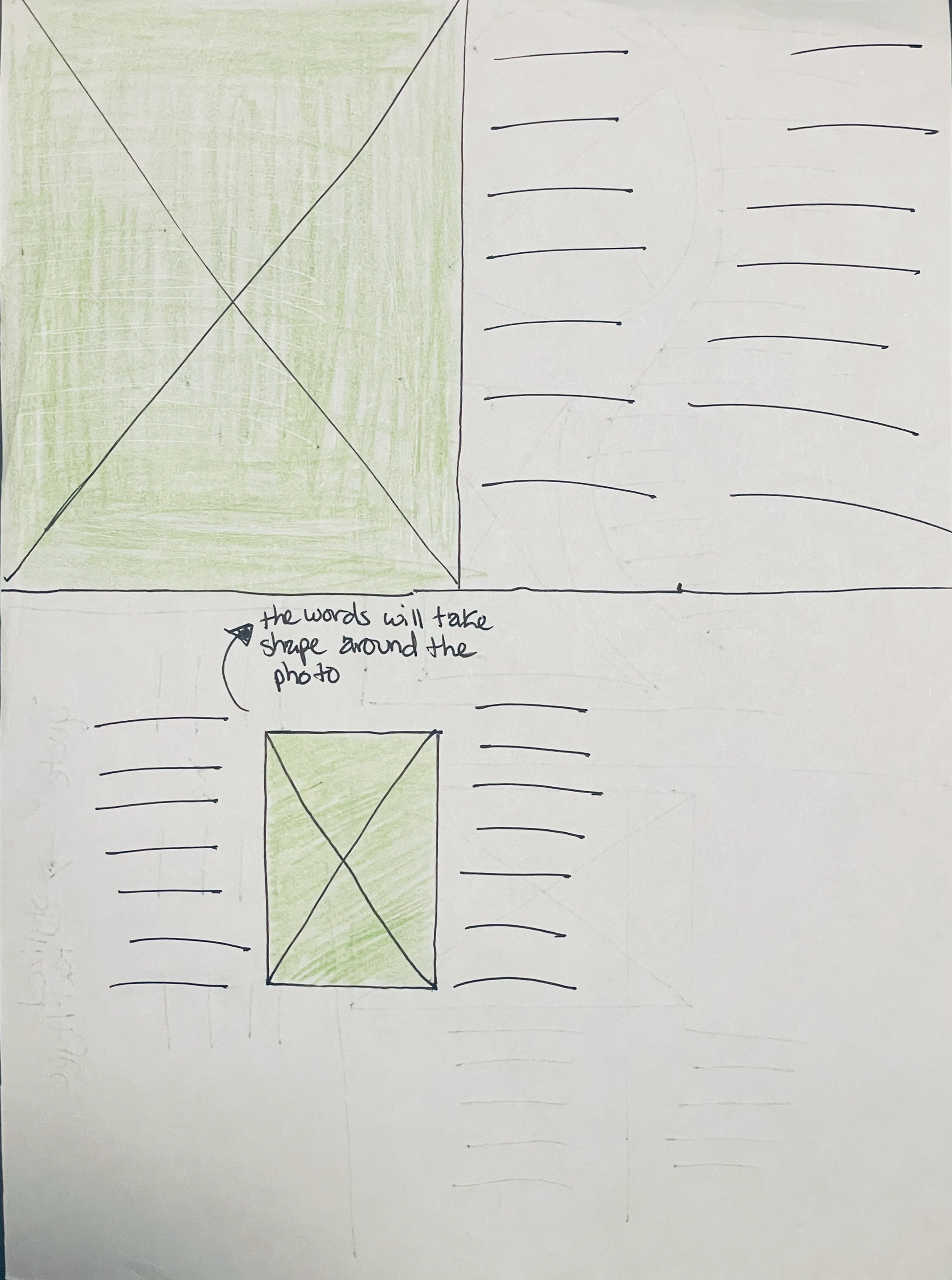
This magazine article project aimed to design a 4-page layout simulating a magazine editorial article. The layout includes a two-page spread (standard 9x12 inches) and follows basic "Grid System" principles. While the design is predominantly text-based, imagery is also integrated alongside the copy to create a cohesive layout. A strong use of symmetry is evident in the relationship between images and text, along with a clear visual hierarchy and balance. The grids provide an underlying structure that enhances clarity, legibility, balance, and symmetry throughout the layout.
Note: This project was created solely in Adobe InDesign.
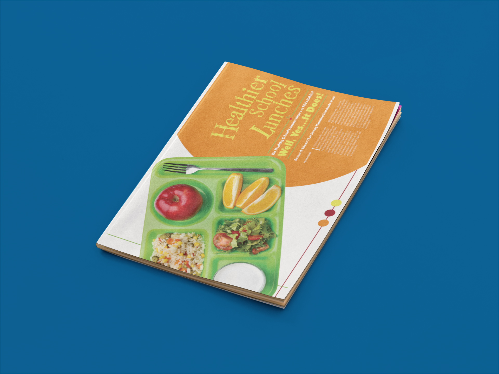
Magazine Cover Page
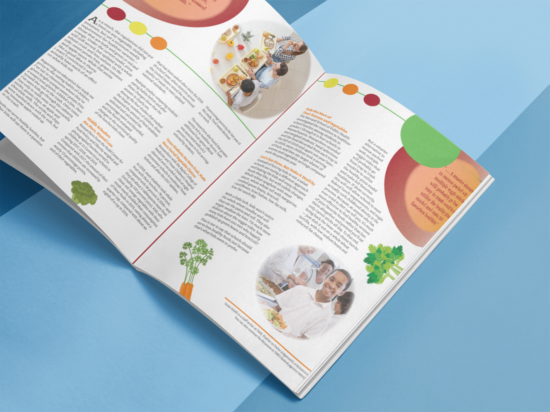
Magazine Open Page Content

Magazine Cover Layout
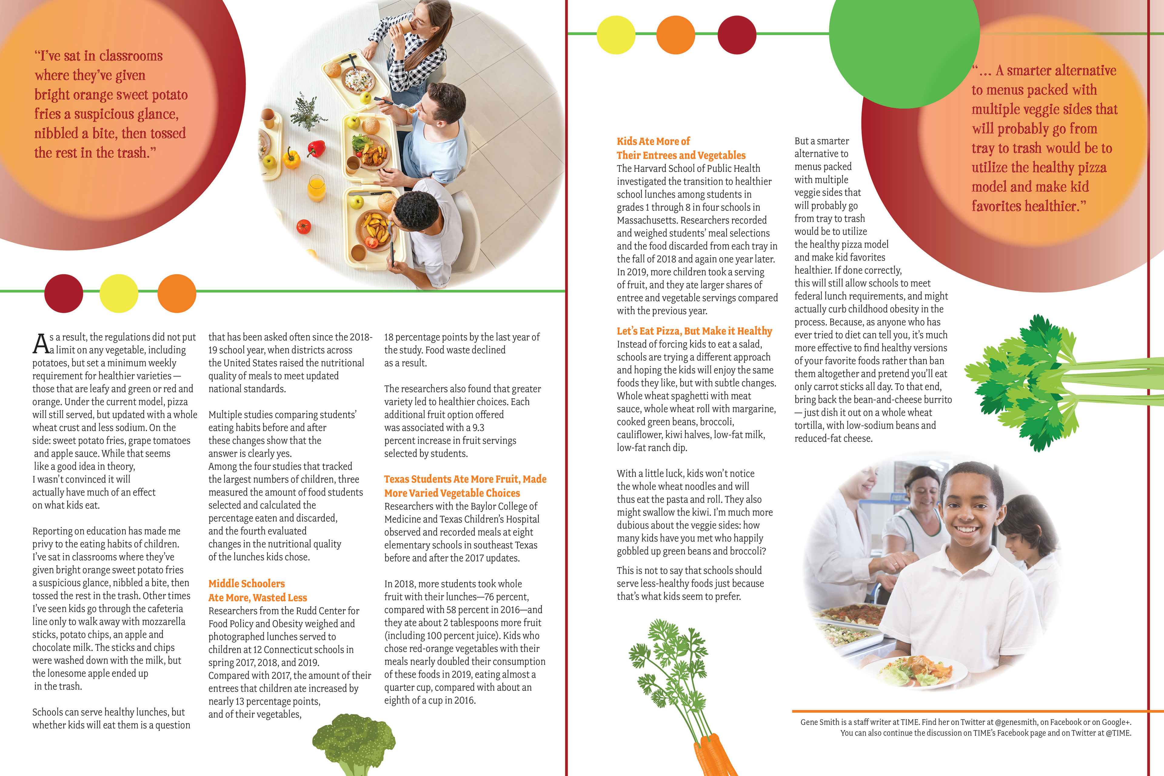
Magazine Content Pages Layout
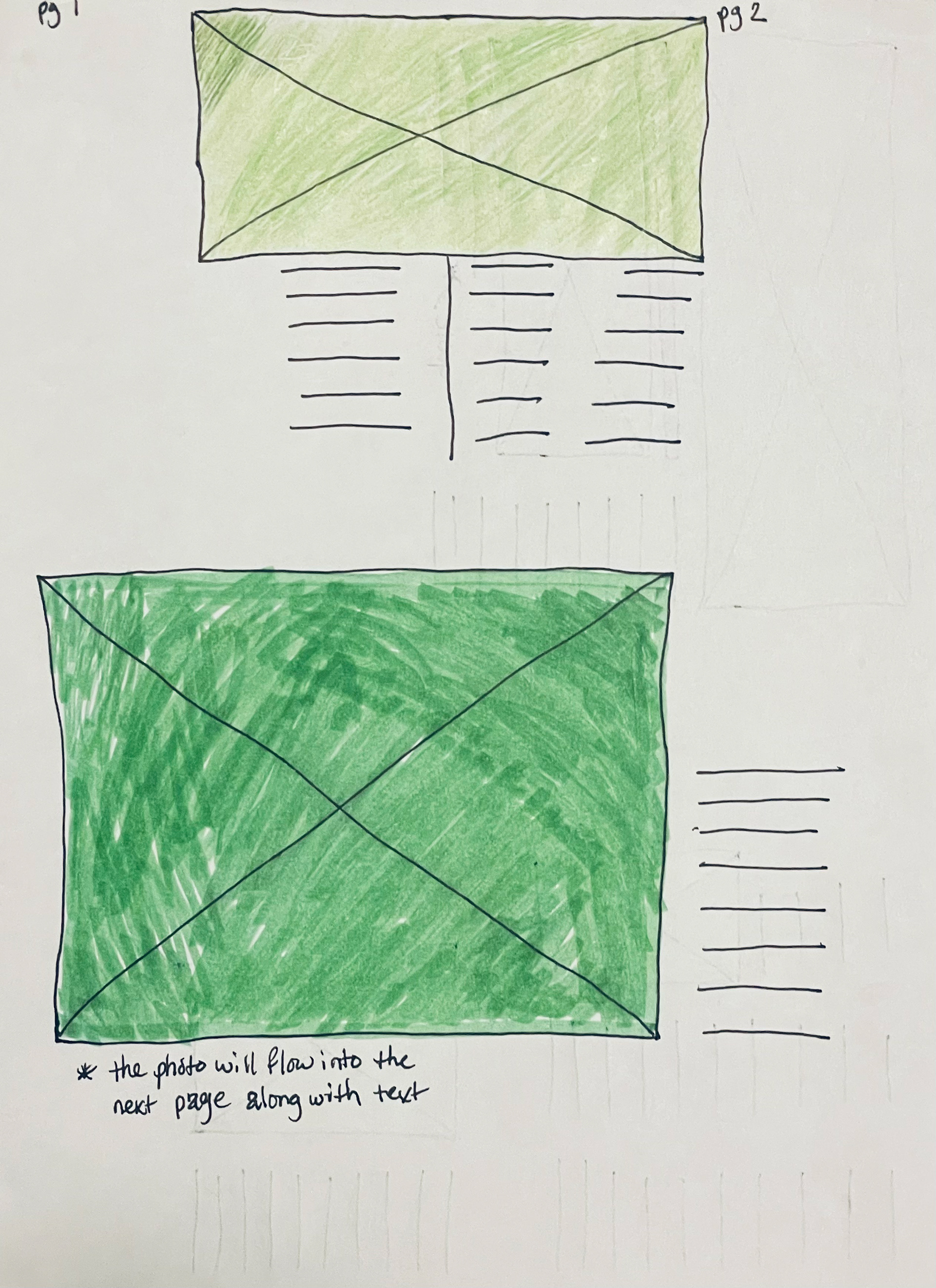
Sketch Layout 1
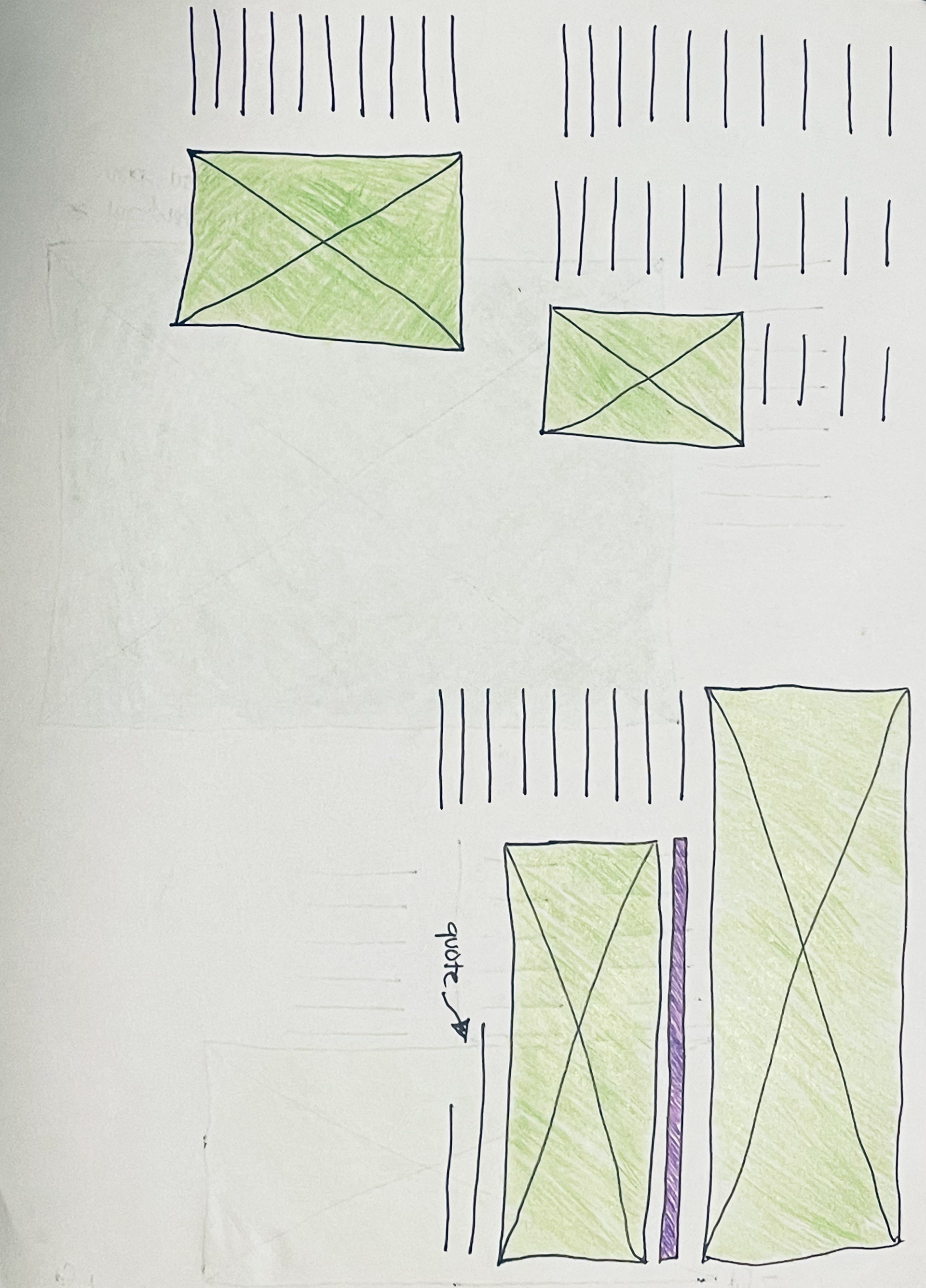
Sketch Layout 2
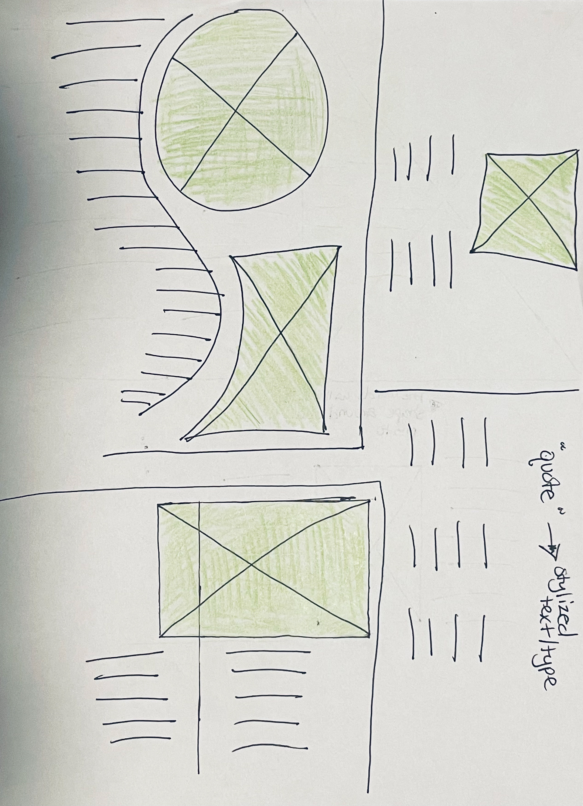
Sketch Layout 3
