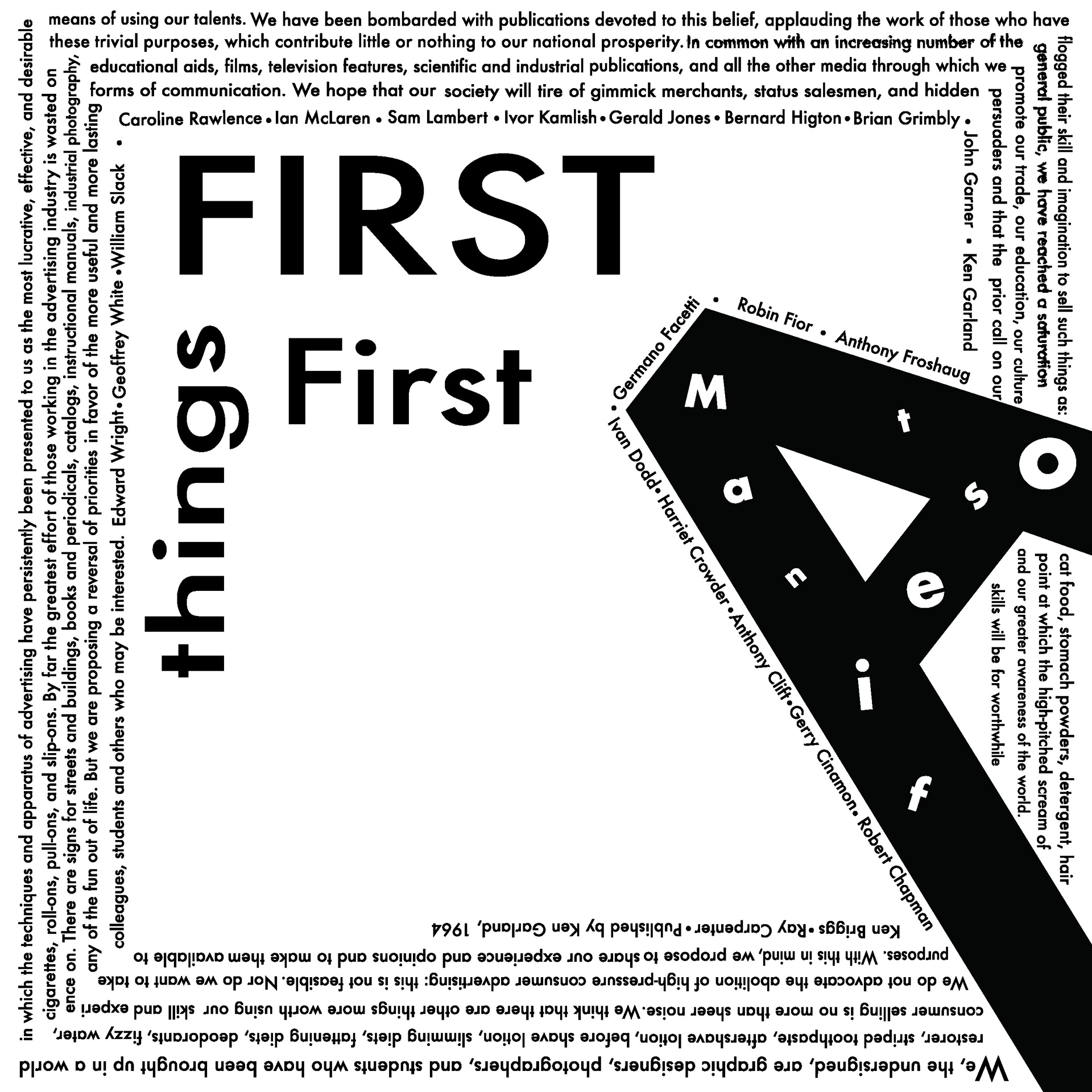
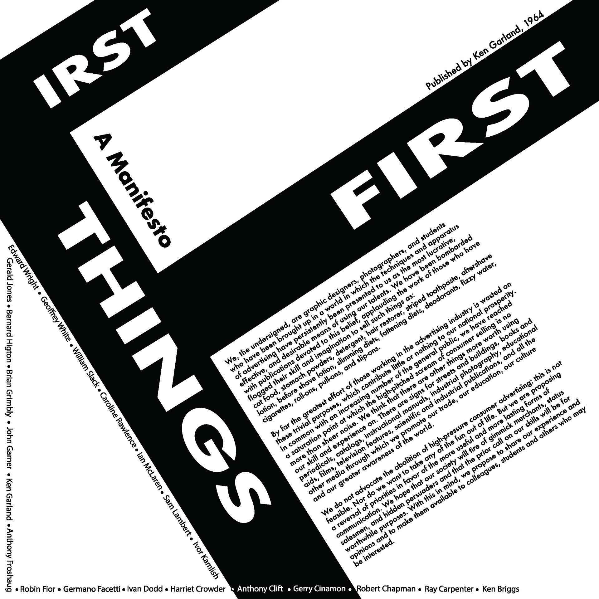
This project explores the power of typographic hierarchy and grid systems in visual communication. Tasked with creating an advocacy poster, I utilized Karl Gerstner’s modular grid to structure the layout, allowing for clarity, balance, and a strong visual flow.
The design applies intentional typographic techniques to guide the viewer’s eye—from a bold, attention-grabbing headline, through a compelling subhead, into the body copy, and finally toward a list of names and the author credit in fine print. Each element was carefully composed to maintain readability, rhythm, and impact, while reinforcing the advocacy message.
This piece reflects my ability to use design systems to enhance narrative and information hierarchy in advocacy-based visual storytelling.
Note: This project was created in Adobe Illustrator & InDesign.
Layout 1